Monday, November 2, 2009

Illusions of Space - Exaggerated Size


Madonna Rucellai, tempera on wood by Duccio, 1285; in the Uffizi Gallery, Florence.
© Photos.com/Jupiterimages

In two-dimensional forms of art such as painting, artists usually want to convey feelings of depth and/or space. One of the easiest ways to convey space is through size. We as humans realized that the farther away an object the smaller it became, thus we could convey this in art to add a realistic feeling to a piece. But, in some periods of time and through different styles of art, there has been an idea that by showing a difference in size we could as viewers would be able to understand the differences in importance of the figures.  The larger the people were the higher their status and the more important they were. This idea is called hieratic scaling; it is scaling by size (as an indicator of importance) rather than space. In the picture above we see Madonna (another name for the Virgin Mary) holding the infant Jesus on her lap. We see that she is much larger than any of the other angel figures around her. In addition she is placed right in the center of the piece also adding to her very high status. The infant Jesus on her lap is also quite larger in comparison to the other figures. He and the Virgin Mary are in proportion, only on a larger scale than that of the smaller figures. We can see that Jesus, that although has the body of an infant has the face of a fully-grown adult - also adding to his status. But also because of this illusion of space, we see that it is a scene from out of this world and set in the divine world. There are no trees, or natural space around the figures because we are seeing figures that are godly or above the status of humans and because of their size are above or in a different more divine place than that of the human world. We grasp this concept because of the idea of exaggerated size and the illusion of space it creates. Although this painting has figures in different scales, it still represents space. We understand that there is a Virgin Mary and baby Jesus sitting on a chair surrounded by angels. We understand the depth through the perspective of the chair and the importance of the figures through hieratic scaling. 

[Image from: http://media-2.web.britannica.com/eb-media/21/121121-004-0ECB4C4D.jpg]

Sunday, November 1, 2009

Rhythm and Pattern Found in the Nelson Art Gallery


Pattern and rhythm are two concepts that come to mind when looking at the quilts in the Nelson Art Gallery in Davis, CA. When we think of rhythm we think of repetition and visual unity that guide and lead us through the image we are looking at. We also associate rhythm as used in music, so when looking at a piece we say it has rhythm when we can imagine without words, the sensation of hearing a beat. When a pattern is repeated in the piece a pace can be established for looking at it because the viewer’s eye moves across the recurring motif, providing repetition and giving us the sense of rhythm. In the first picture above, we can see the pattern (or the human need to visually recognize a reoccurring theme to add visual unity to the piece) has repeating horizontal and vertical line blocks of fabric. The different colors not only help the visual repetition but also make it much more lively; inducing our brains to imagine a rhythm that is much more upbeat.  The pattern also seems to swirl in a way, starting from the outside corners and working its way in, where the lines come closer together as if about to implode. This pattern leads me to imagine that the rhythm, is working its way from the outside edge, leading up to and just about to enter its climax at the center of the piece.
      In the next picture right below the first, we see another form of visual pattern, which leads us to a rhythm. In the quilt in the center of the picture (the black and white one that looks like it has many repeating bows on it), we can see some visual “slippage” in which the artist plays with our eyes by putting two bold colors side-by-side, using a few repeating shapes, but changing the color of them from one to the next (ex: from black to white to black). This makes our mind want to search for a pattern, to give unity back to the piece, using pattern to make sense for what unity is lacking. So now that we have established the pattern, we see start to understand the rhythm. It is bouncy and all over the place, but it is pretty simple. The simplicity of a commonly repeated pattern give emphasis all over, to the entire piece.  If we look at this piece close-up we see that is not as unified as it is from far away. The pieces of cloth material used in this piece change not only texture, but color as well (see last picture below). It is not a solid black and white piece, there is much more variety than we had first anticipated. The other thing about the rhythm of this piece is that it never seems to end. Because there are no clear changes of pattern, our eyes jump back across the piece over and over, making the rhythm a constant, never-ending loop.


[Images from: My own Camera, Images in order: (top left) Ora L. Thompson. Untitled. circa 20th century. cotton. collection of Sandra McPherson, (top right) Mrs. Longmire. Silk Medallions. circa 1880. silk, cotton. collection of Sandra McPherson, (bottom left) Donnie Chambliss. Slave's Popcorn Quilt. circa late 19th century. cotton. collection of Avis Collins Robinson, (bottom middle) Avis Collins Robinson. Piano Keys. 2009. cotton, (bottom right) Avis Collins Robinson. My Mama is Dead. 2007. cotton, (bottom center) Ora L. Thompson. Untitled. circa 20th century. cotton. collection of Sandra McPherson ]

Rhythm and Texture - Jackson Pollock


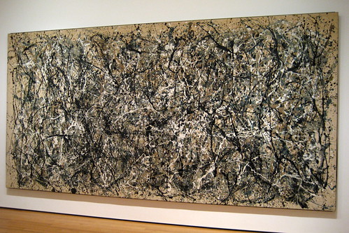
NYC – Moma: Jackson Pollock’s One : Number 31, 1950. 
Oil and enamel on unprimed canvas. (above)


     Rhythm is a term commonly associated with music, however visual rhythm is a quality that can also be used when talking about design. Rhythm is the movement is the movement of the viewer’s eye in conjunction with repetition. Much like some of masters of the musical world, Jackson numbered and lettered his paintings, allowing the viewer to look at the piece to receive what it has to offer instead of looking for a preconceived idea of what is there. In the Jackson Pollock painting above, One: Number 3, the viewer has an understanding of the rhythm through the repetition of the strokes of color, which are running across the canvas in a chaotic pattern. The varied shape and thickness of the lines and the randomness of the how the paint was put on the canvas allows us to visualize a beat or a constant feeling of movement as our eyes dance across the painting. The unpredictability and variation of the strokes adds to the dynamism and unsettling rhythms that could be compared to a musical genre. The contrast between the light and dark or loud and soft colors give depth to the piece and enhance the sense of pulsation. We also see the same elements reappear, creating alternating rhythms. Making our eyes bounce or travel back and forth between the vibrating colors and alternating direction of diagonal, vertical, horizontal, etc. lines. This element in the painting is similar to the musical term “spiccato” meaning “bouncing bow.”
     Texture refers to the feeling of touch that it can evoke in a viewer. In this painting there is a three dimensionality of the texture, creating a visual pattern as well as rhythm through the shadows and depth conveyed. The texture invites the viewer to explore the piece much more closely, and here in Pollock’s painting we can see and imagine the tactile texture – again adding to the piece by creating a rhythmic gesture. We can say that Jackson’s paintings are not just pictures, but a representation of movement in time through rhythm and texture.

Saturday, October 24, 2009

Emphasis and Focal Point


     Emphasis relates to how a designer will catch a viewer's eye, the emphasized element can attract a viewer and encourage them to look at it further. One way an artist can do this is through a point of emphasis also known as a focal point. In the painting below (left) by Johannes Vermeer The Art of Painting (oil on canvas) we see that emphasis is placed on the young girl that Vermeer is painting in the painting. We see that the light in the painting draws emphasis to her body, as well as the complementary colors between the blue of her dress and the yellow of the book she is holding. In addition she is also centered in the painting, and is lighter in comparison of the darker gray and muted colors surroundings. The curtain in the foreground is pulled back allowing us as the viewer to see the young woman, the wrinkles in the curtain also forms lines that point to her.  There are other lines that also lead straight to her, she is the intersection point of the horizontal and vertical lines of the map in the background. All of these elements bring the emphasis and our focus to the main character or focal point, showing the concepts of emphasis and focal point. 


     Focal points also occur naturally in the 3-dimensional world. When we look at the picture above we see that the emphasis is on the tall steeple (the tall spire erected as a tower of the church) of the church. This steeple serves as the focal point of our attention because of its unusual size as well as color. It is much bigger than any of the other surrounding objects. The cars and even the large semi-truck and tall pine tree are dwarfed by the size of the steeple. The white of the steeple also plays off the blue background of the sky, making it "pop out" at the viewer. In addition to this, the steeple is placed near the center of this photograph (in real life, the steeple may not be as centered, but in the function of this picture it contributes to the aspect of it being the focal point).  


[Images from:
 http://www.essentialvermeer.com/catalogue/art_of_painting.html, http://gis.deat.gov.za/isrdp/More_Info/Photo_K/Focal_point2.JPG]

Unity


    Unity is "...the presentation of an integrated image, [and] is perhaps as close to a rule as art can approach (Design Basics, p.28)." Unity is found in many things including both 2D and 3D designs. In the picture above (right) we immediately see that these figures are similar. The unity between them is not just because we recognize all the people as women, but also through the repetition of their arms sweeping outwards toward each other. Their arms intertwine and we see a connection or unification of their bodies. In addition the vertical lines of their long dresses draping downward and blend together. We also see hints of red and orange with accents of the contrasting blue color throughout the figures unifying the composition and adding to the overall unity found within the painting. 


     We also see unity in not only 2D designs but 3D designs as well. In the picture of a seven headed African elephant unity carving above on the left, we see unity through repetition. If we took this statue apart and only saw one of the figures we would not be able to understand the meaning of this piece. The repetition of the 7 heads facing inwards and interlocking bodies greatly emphasizes the unity we see in this object. The different angle variations as well as the slight variations of the hand-carved heads in help balances unity with variation. This approach of using a common theme (in this case a repeating image/ head of the elephant) and the variation of the angels are the backbone of unity.


[Images from: http://www.art.com/products/p12153447-sa-i1540138/monica-stewart-unity.htm,  http://www.acaciawoodcarvings.com/servlet/the-113/elephant-seven-head-unity/Detail]

Gestalt Theories


     Gestalt theory states that the mind and brain function together, to unify that which may not be there. We look at the whole and the overall perception of that whole is different from the sum of its parts. Together our senses work to recognize whole forms and figures instead of just simple lines or parts, we may even add information where there is no actual information just to “complete the picture.” One of the major gestalt principles is that of emergence. Demonstrated in the picture above 
(from http://christianhubert.com/writings/Gestalt1.jpeg) shows a Dalmatian dog sniffing at the ground.  Instead of recognizing different parts of the dog (such as the tail or ears or paws), we immediately recognize the dog as a whole. From the formation of the way marks are made on the paper, in conjunction with the negative (empty space) and positive (filled space) spaces we infer the boundaries (that don’t really exist) of the dog. In addition to that, the way the marks are placed or the space between them, it makes it easier to unify them; as viewers we tend to group objects that are close to each other into a larger unit. And in turn, the dog pops out of the background in which it is set. Thus we see the gestalt theory in action!


Try this Gestalt Image: Do you see a woman or a saxophone player?

[Image from: http://www.skagitwatershed.org/~donclark/hrd/history/gestalt.html]

Tuesday, October 13, 2009

Not all designs were created equal!


       As humans we have learned to be critical and judge. We judge and compare everything we see. We also give into what is popular or “cool.”  However, this idea of “cool” is deceptive. It builds upon human weakness – our need to fit in and be accepted. “Coolness” was created in the mind and is only in the mind. Sometimes we even believe we are being original – we’re probably not.  Originality stems from archetypes of primitive models, which were the first models of all things.


     Designs are indeed solutions to our problems, but sometimes we take design too far. We have solved our basic problem or need and now use design as a means of classifying people. Sometimes we even use design as a hierarchical status symbolizer. Jeans are an example of this. These jeans all serve a functional purpose and the only real difference between them is the design on the back pockets of the jeans. Perhaps some of these jeans have nicer quality fabric, but that is not always the case. But one thing is, if your jeans don’t have one of these iconic little symbols stitched onto the back pocket of your jeans – who are you? To some, you’re a ‘nobody.’ So why are these jeans better? Well because they’re ‘in.’ At one point in time these jeans were new and no one heard of them. Someone, the innovator, began to wear them and that was the beginning. When society tells you what jeans are in, you don’t tell society they’re wrong – to them you’re wrong. It accept the fact that these jeans are popular, weather you wear them or not – they are. But what about all the failed designs?  For every design that becomes popular or in style there are about 500 others that are forgotten. Maybe one day, they’ll be rediscovered, but for the most part the will go unnoticed for the entirety they are in existence.
        Jeans are not the only things as you can imagine that was not created equal. Cars, furniture, dresses, shoes, etc. There is a hierarchy or popularity rating for all these things. Going back to our original question – why do we accept some things over others? Because it is our human nature yes, but I believe it also has to do with money. Money or objects as a sign of wealth or social status is something the human culture will never give up. We all try to outdo each other in some way or another and in this day in age it is what you have that is important. We don’t really know ‘who’ controls what is popular, what stays popular, what is accepted and what isn’t. But in some small way we can help to decide what is in or not. As consumers in this day in age we drive the business, we tell the designers what we want we pull the designs we want out of them – they don’t push their designs on us (it used to be this way back in the 1800s).
      So when I say not all designs were created equal I meant in terms of popularity among the masses. In the case of the individual or the personal heart some things are priceless. As expensive as your designer jeans might be or some other popular symbolic status indicator, a lot of the time it is the sentimental value of things that make them special to us – and nothing can buy the design of affection.


Pictures in order from start to end from: (paige jeans) http://www.mystyle.com/mystyle/, (true religion jeans) http://dionsdailydeal.wordpress.co, (citizens of humanity) http://www.chrisabraham.com/COHKellyStretchJeans.jpg