
(http://commons.wikimedia.org/wiki/File:Van_Gogh_Museum_Amsterdam.jpg)
... I took out my camera to snap a photo of the beautiful canals that line the roads and realized to my surprise it wasn't working! I thought; 'oh no my battery must not be charged, oh well I will have to charge it when I get back to the hotel.' So I put my camera away and continued about my day. When I returned to the hotel I plugged my charger into the wall (with the special European adaptor) and yet the light didn't turn on ... I left the camera battery on my desk in my room!!
It was a horrible feeling knowing I had come alllllll this way and was now unable to take photos. I searched in a few electronic shops for batteries, but no luck. With the exchange rate being so bad I couldn't afford to buy a new camera, so I finally came to the conclusion that I would just have to take a lot of mental images =(
So the lesson is learned now, DON'T FORGET YOUR CAMERA BATTERIES WHEN TRAVELING ABROAD!!!
Where I went:

(Amsterdam)


(I AMsterdam)
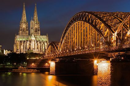
(Köln, Germany)

(Basel, Switzerland)

(Bern, Switzerland)

(Balsthal, Switzerland)

(Luzern, Switzerland)

(Zurich, Switzerland)
[Thanks to GOOGLE for the images]


