Sunday, November 22, 2009

Snowboard Evolution


Burton Custom X snowboard


       In 1965 the first “snowboard” was designed by Sherman Poppen, called the “Snurfer.” Jake Burton Carpenter later redesigned the “Snurfer” into the modern day snowboard in the 1970s.  As time went on boards progressed boards began to be made out of fiberglass, with metal edges and high-backed boot and binding systems for extra control and comforts, which then evolved, into the high-tech materials used today. The best thing about snowboards is the variety of colors and wild graphic designs that come on the board. From crazy arrays of lines, organized pictures, swirls, cartoons and so much more.  Snowboard are bright, embrace color and new attitudes of design. They break away from the traditional and are a wave, creating the future. Whether you are a 10-year-old boy or 20-year-old girl I guarantee that when you go out and search for that snowboard of your dreams you will find something or many something’s that suit your interest. With popular brands such as Burton and ROME SDS come creative, innovative designs that “pack a punch.” With the growth of the sport over the last 20 years has also come a growth in popularity of becoming a snowboard graphic designer. There are even competitions around the world exclusively based on snowboard design. The designs of the boards are not only inspiration but also lend motivation and empower the riders riding them.


[Photos from: http://www.coolershaker.com/wp-content/uploads/2009/05/snowboard_evolution.jpg, http://www.ltcconline.net/wallace/LTCC%20Snow%20Riders%20Club/snurfer%20ad.jpg, http://images.google.com/imgres?imgurl=http://snowboardreviews.com/wp-content/uploads/2008/08/burt-custom-x-2009.jpg&imgrefurl=http://snowboardreviews.com/burton-custom-x-2009/&usg=__l7wFzYqjQdj_oObl92K9UXEkDQY=&h=300&w=254&sz=12&hl=en&start=15&um=1&tbnid=p1r-tgiAyXWZGM:&tbnh=116&tbnw=98&prev=/images%3Fq%3Dburton%2Bsnowboard%2B2009%26hl%3Den%26sa%3DG%26um%3D1]


Nathan Shedroff - Sustainable Innovation


      On Wednesday November 18th, 2009 I heard Nathan Shedroff  speak on the UC Davis Campus in California. His major theme of his lecture was “sustainable innovation.” There are three main ideas that are key in creating sustainable innovation: Design – Sustainability- Business. Overlapping they lead to meaningful connections and experiences that are key. Nathan started off the lecture by asking some questions that are nearly if not impossible to answer. The first was “What’s amore sustainable future look like?” Although we cannot answer this question at this time we can look to other countries, which are moving toward or already are living a more sustainable life such as Brazil and Cuba. Currently Cuba is the most sustainable nation on the planet currently. Brazil is leading the way in making changes toward a more sustainable life. The second thought provoking question Shedroff asked was “What’s a more meaningful world look like.” This is a question that we may never be able to answer. Interaction and meaning define the world we live in. The next question was “What’s a post-consumer world look like?” One way Brazil has cut back on their “visual clutter/noise” was by outlawing any outside advertising. Although we don’t have the answers to these questions, that is what design is good for – helping to answer them.
      Nathan Shedroff’s lecture was communicated very effectively. I thought he spoke well and he articulated his speech. His PowerPoint demonstrated ideas without being over cluttered with words, but mainly focused on images. In addition he had ideas that seemed to be new and enlightening. I personally was excited that this wasn’t just another lecture on “how to be green.” It was actually quite the opposite, it was more about how we can all make life changes toward a better future. He asked though provoking questions, that made the audience wonder about what our future will hold. 

[Photos from: http://estimulo.files.wordpress.com/2008/09/nathan.jpg, http://2009.dconstruct.org/images/speaker-badge-nathan-shedroff.png]

OBJECTIFIED


The film Objectified; a documentary film by Gary Hustwit, portrayed a series of artists and the objects that they created. It showed a complex array of various designs with modern ideas. The objects featured ranged from MAC computers, to sofas, potato peelers, and even toothbrushes. The relationship between form and content was inspiring. Artists would take old ideas or objects and reinvent them, they would take old ideas and make them new; usually making them better and more eco-friendly. It was interesting seeing the evolution of these objects, because most of them were objects or pieces of objects that one wouldn’t normally think about or give a second thought to. Maybe that is what makes these objects so great, their ability to adapt or be adapted by anyone. In the film they said “almost everything has been designed in one way or another.” I think this quote is great because most people don’t normally think of their toothbrush being “designed.”  One artist also said that, “in every design there was a design and decision made about that object.” However small the object may be, meticulous thought has actually gone into making that object better and more pleasing to us, so maybe we won't judge them as harshly or even notice them as much - because “we make assumptions about objects in seconds- how much it should cost, weigh, etc.” One example of an object you wouldn't normally think of is a toothpick, which was designed for the tip to break off and be used as a thing to rest the toothpick on.
     The film overall communicates an argument about contemporary designs and designers by showing how these designers are taking the everyday and making them more superior so they can stand up in the harsh society that we live in today. They are also taking into account our current world situation and how we are in need of preserving natural resources, by making their objects use materials to their full capability –while helping the environment. Taking old objects where “form followed function” to new phases of formal design. They are focusing on what will happen not what has happened. They are changing their designs to match that of our changing views of how we look at the world, getting rid of everything that doesn’t maximize unity and harmony.  They are designing by simplifying.  


[Photos from: http://www.typeneu.com/v2/wp-content/uploads/2008/07/objectified.jpg, http://cache.gizmodo.com/assets/kindle2/Objectified-Poster-Large.jpg, http://givemefreestuff.info/wp-content/uploads/2009/02/mac_book_air3.jpg]

Joseph Cornell


Joseph Cornell was born in 1903 and died in 1972 at the age of 69 years old.  He was an American born artist and is very famous for his sculpture and collage. Some of his most recognizable pieces were his boxes created from objects he found or had, such as pipes, photographs, and old love letters.  The boxes are simple and usually have a glass front. They are interactive and portray an irrational juxtaposition of different objects. He combined constructivism of the boxes along with Surrealism (a European art movement that emphasized dreams and poeticism in the 1920s and 1930s). It seemed that objects that were once beautiful, loved, and precious fascinated him.  The boxes evoke feelings of nostalgia and one who is viewing them can find them recalling a past event, object or moment they once had. Or at least that is how I felt when I saw his exhibit at the San Francisco MOMA a few years back. In a book about Cornell called “Joseph Cornell, Navigating the Imagination,” we find that Cornell’s aim of his artwork was not only to explore art, culture, and science but also to inspire others to voyage into the imagination. Cornell was an artist driven by curiosity and creativity rather than by theories or formal art training. 


[Photos from: http://www.baseballreliquary.org/images/JosephCornell.jpg, http://openreflections.files.wordpress.com/2009/06/joseph-cornell1.jpg, http://www.johnbailly.com/edu/projects/Cornell.Medici.jpg, http://z.about.com/d/arthistory/1/0/j/Z/jcni_13.jpg]

Josef Albers


Painting by Claude Monet: Impression, Sunrise (1872)


Josef Albers was born in 1888 and died in 1976 at the age of 88 years old. He was a German-born American artist and wrote books such as “The Interaction of Color.” He was a very accomplished designer and excelled in multiple areas ranging from photographer to poet. But, he is best known for his work as a painter. He also worked as a theorist, coming up with new ideas about color theory. In his book “The Interaction of Color,” Josef observed many different ideas and interactions of color, one of which was optical mixing.  He described this as the “pulling” or “pushing” of colors into different appearances. Two colors which are juxtaposed and perceived simultaneously are seen by the human eye as one new color; the two original colors were annulled and replaced by a substitute called optical mixing. The findings that our perceptions change when our eye mixes the colors led to a new painting technique. This technique is one of the best representations of optical mixing and is called impressionism. Impressionist artists, such as Claude Monet used small dots, or sometimes "globs" of different colors and place them close together so when viewed from afar they mix and not only become a new color (optical mixing!) but also add movement and drama to a piece. 


[Photos from: http://media-2.web.britannica.com/eb-media/72/13572-004-595D9C39.jpg, http://23.media.tumblr.com/aHyNHMV3lechplzahjxsS0sko1_400.jpg, http://images.google.com/imgres?imgurl=http://www.brown.edu/Courses/CG11/2005/Group161/signacHarborofSaint-Tropez.jpg&imgrefurl=http://www.brown.edu/Courses/CG11/2005/Group161/History.htm&usg=__3b865F3mkVALSVGQwXivjT9geKc=&h=600&w=473&sz=135&hl=en&start=13&um=1&tbnid=nIWoi1HIe0QfgM:&tbnh=135&tbnw=106&prev=/images%3Fq%3Doptical%2Bmixing%2Bimpressionist%26hl%3Den%26sa%3DN%26um%3D1]

Color Theory


     Color Theory is the set of principles, which are used to guide and make harmonious color combinations. From color theory the color wheel was developed, aiding artists and designers and the public alike as a tool, defining basic relationships of color. Almost all of us at some point in our lives had to make a color wheel, so we’ve all had experience with how color interacts. The origins of color theory evolved from primitive colors, now known as the primary colors; red, yellow and blue. The theories on the qualities of how these colors were blended enhanced when “complementary” colors, or colors of opposing hues  were produced.  These color observations were summarized in the findings by Goethe in the “Theory of Colours” in the 1800s. The goal of color theory is to find and mix colors that work well together. However the ideas of how the colors work is up to interpretation. The Juxtaposition of colors lends to produce strong contrasts and tension some say, while they also produce harmonious color interactions as others say. Whatever the opinion, color theory is always used in society by designers and individuals alike to produce or evoke certain emotions. Whether creating the next ipod for Mac or a crayon drawing for your parents, playing with complementary and contrasting colors, or working with the differences in warm and cool colors; color theory will lead you to your final destination. There is no right and wrong in picking colors, it is simply your idea of what looks right and wrong when producing your work. 


[Photos from: http://www.the1948timemachine.com/portfolio%20graphics/PORTFOLIO%20NEWBIES/avian-color-theory.jpg, http://images.google.com/imgres?imgurl=http://goldtent.net/wp_gold/wp-content/uploads/2009/01/color_theory.jpe&imgrefurl=http://hasan11.seesaa.net/article/131390169.html&usg=__hK4UYOJ-pzT4JH96RKJd61h-i9s=&h=880&w=980&sz=1017&hl=en&start=3&um=1&tbnid=-sxK11lL-SkReM:&tbnh=134&tbnw=149&prev=/images%3Fq%3Dcolor%2Btheory%26hl%3Den%26sa%3DN%26um%3D, http://images.google.com/imgres?imgurl=http://wpcontent.answers.com/wikipedia/commons/thumb/7/7c/GoetheFarbkreis.jpg/180px-GoetheFarbkreis.jpg&imgrefurl=http://www.answers.com/topic/color-theory&usg=__lh3ZIcKJxl0DeXsFBrHOQJxZEn0=&h=188&w=180&sz=19&hl=en&start=35&um=1&tbnid=mG5lu8ZI8wrJlM:&tbnh=102&tbnw=98&prev=/images%3Fq%3Dgoethe%2527s%2Bcolor%2Bwheel%26ndsp%3D21%26hl%3Den%26sa%3DN%26start%3D21%26um%3D1]

Monday, November 2, 2009

Illusions of Space - Exaggerated Size


Madonna Rucellai, tempera on wood by Duccio, 1285; in the Uffizi Gallery, Florence.
© Photos.com/Jupiterimages

In two-dimensional forms of art such as painting, artists usually want to convey feelings of depth and/or space. One of the easiest ways to convey space is through size. We as humans realized that the farther away an object the smaller it became, thus we could convey this in art to add a realistic feeling to a piece. But, in some periods of time and through different styles of art, there has been an idea that by showing a difference in size we could as viewers would be able to understand the differences in importance of the figures.  The larger the people were the higher their status and the more important they were. This idea is called hieratic scaling; it is scaling by size (as an indicator of importance) rather than space. In the picture above we see Madonna (another name for the Virgin Mary) holding the infant Jesus on her lap. We see that she is much larger than any of the other angel figures around her. In addition she is placed right in the center of the piece also adding to her very high status. The infant Jesus on her lap is also quite larger in comparison to the other figures. He and the Virgin Mary are in proportion, only on a larger scale than that of the smaller figures. We can see that Jesus, that although has the body of an infant has the face of a fully-grown adult - also adding to his status. But also because of this illusion of space, we see that it is a scene from out of this world and set in the divine world. There are no trees, or natural space around the figures because we are seeing figures that are godly or above the status of humans and because of their size are above or in a different more divine place than that of the human world. We grasp this concept because of the idea of exaggerated size and the illusion of space it creates. Although this painting has figures in different scales, it still represents space. We understand that there is a Virgin Mary and baby Jesus sitting on a chair surrounded by angels. We understand the depth through the perspective of the chair and the importance of the figures through hieratic scaling. 

[Image from: http://media-2.web.britannica.com/eb-media/21/121121-004-0ECB4C4D.jpg]

Sunday, November 1, 2009

Rhythm and Pattern Found in the Nelson Art Gallery


Pattern and rhythm are two concepts that come to mind when looking at the quilts in the Nelson Art Gallery in Davis, CA. When we think of rhythm we think of repetition and visual unity that guide and lead us through the image we are looking at. We also associate rhythm as used in music, so when looking at a piece we say it has rhythm when we can imagine without words, the sensation of hearing a beat. When a pattern is repeated in the piece a pace can be established for looking at it because the viewer’s eye moves across the recurring motif, providing repetition and giving us the sense of rhythm. In the first picture above, we can see the pattern (or the human need to visually recognize a reoccurring theme to add visual unity to the piece) has repeating horizontal and vertical line blocks of fabric. The different colors not only help the visual repetition but also make it much more lively; inducing our brains to imagine a rhythm that is much more upbeat.  The pattern also seems to swirl in a way, starting from the outside corners and working its way in, where the lines come closer together as if about to implode. This pattern leads me to imagine that the rhythm, is working its way from the outside edge, leading up to and just about to enter its climax at the center of the piece.
      In the next picture right below the first, we see another form of visual pattern, which leads us to a rhythm. In the quilt in the center of the picture (the black and white one that looks like it has many repeating bows on it), we can see some visual “slippage” in which the artist plays with our eyes by putting two bold colors side-by-side, using a few repeating shapes, but changing the color of them from one to the next (ex: from black to white to black). This makes our mind want to search for a pattern, to give unity back to the piece, using pattern to make sense for what unity is lacking. So now that we have established the pattern, we see start to understand the rhythm. It is bouncy and all over the place, but it is pretty simple. The simplicity of a commonly repeated pattern give emphasis all over, to the entire piece.  If we look at this piece close-up we see that is not as unified as it is from far away. The pieces of cloth material used in this piece change not only texture, but color as well (see last picture below). It is not a solid black and white piece, there is much more variety than we had first anticipated. The other thing about the rhythm of this piece is that it never seems to end. Because there are no clear changes of pattern, our eyes jump back across the piece over and over, making the rhythm a constant, never-ending loop.


[Images from: My own Camera, Images in order: (top left) Ora L. Thompson. Untitled. circa 20th century. cotton. collection of Sandra McPherson, (top right) Mrs. Longmire. Silk Medallions. circa 1880. silk, cotton. collection of Sandra McPherson, (bottom left) Donnie Chambliss. Slave's Popcorn Quilt. circa late 19th century. cotton. collection of Avis Collins Robinson, (bottom middle) Avis Collins Robinson. Piano Keys. 2009. cotton, (bottom right) Avis Collins Robinson. My Mama is Dead. 2007. cotton, (bottom center) Ora L. Thompson. Untitled. circa 20th century. cotton. collection of Sandra McPherson ]

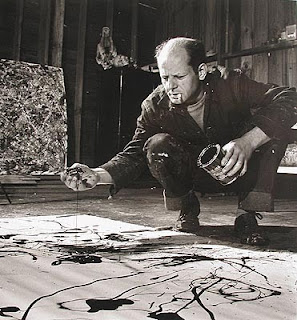
Rhythm and Texture - Jackson Pollock


NYC – Moma: Jackson Pollock’s One : Number 31, 1950. 
Oil and enamel on unprimed canvas. (above)


     Rhythm is a term commonly associated with music, however visual rhythm is a quality that can also be used when talking about design. Rhythm is the movement is the movement of the viewer’s eye in conjunction with repetition. Much like some of masters of the musical world, Jackson numbered and lettered his paintings, allowing the viewer to look at the piece to receive what it has to offer instead of looking for a preconceived idea of what is there. In the Jackson Pollock painting above, One: Number 3, the viewer has an understanding of the rhythm through the repetition of the strokes of color, which are running across the canvas in a chaotic pattern. The varied shape and thickness of the lines and the randomness of the how the paint was put on the canvas allows us to visualize a beat or a constant feeling of movement as our eyes dance across the painting. The unpredictability and variation of the strokes adds to the dynamism and unsettling rhythms that could be compared to a musical genre. The contrast between the light and dark or loud and soft colors give depth to the piece and enhance the sense of pulsation. We also see the same elements reappear, creating alternating rhythms. Making our eyes bounce or travel back and forth between the vibrating colors and alternating direction of diagonal, vertical, horizontal, etc. lines. This element in the painting is similar to the musical term “spiccato” meaning “bouncing bow.”
     Texture refers to the feeling of touch that it can evoke in a viewer. In this painting there is a three dimensionality of the texture, creating a visual pattern as well as rhythm through the shadows and depth conveyed. The texture invites the viewer to explore the piece much more closely, and here in Pollock’s painting we can see and imagine the tactile texture – again adding to the piece by creating a rhythmic gesture. We can say that Jackson’s paintings are not just pictures, but a representation of movement in time through rhythm and texture.